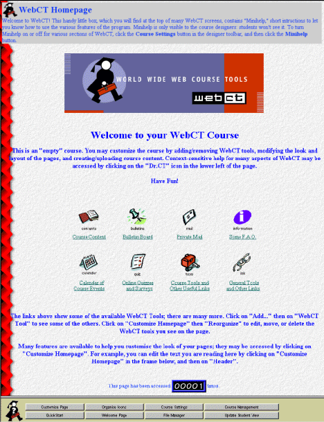

The homepage is divided into two frames. The top frame contains the students' view of the homepage. The bottom frame contains the designer toolbar, which gives the course designer access to the options for each page. We'll be looking at a number of these options throughout this tutorial. The designer toolbar is only visible when the course designer has logged in; it will not be visible to students in the course.
 |
Tip: Click on Dr. CT in the designer toolbar to access online help for the current topic. |
Here is a quick description of the homepage elements. Each one of these items is optional and may be omitted from your homepage.
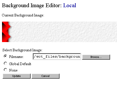
The current background image is displayed at the top. Below the image are 3 radio buttons which allow you to choose either no background image, the global default or an image file to use as a background image. The text-entry box allows you to enter the name of the image file. A Browse... button lets you use the WebCT File Browser to look for files you want to use.
For now, select the None radio button and press Update to return to the homepage. If you had pressed Cancel, the background image would have remained the same. The homepage background has now reverted to the colour specified in the colour selection menu. Let's see how to modify these colours.
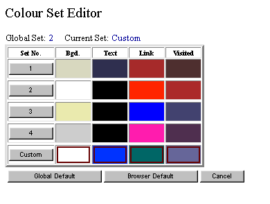
Currently, there are 4 pre-set schemes to choose from, as well as a Custom Colour set which allows you to define your own colour combinations. Each scheme consists of a colour for background, text, links and visited links. The schemes are identified by their numbers, from 1 to 4. Above the table you can see what the current colour scheme is set to. On the homepage, the Custom colour set is in effect, which is set to a white background colour, blue text, green hyperlinks and purple visited links. Right now, let's choose colour scheme 1 by clicking on the hyperlinked 1. This operation will return you to the homepage and change the background to a soothing sand colour. You may notice that the text of the header and footer are still a bright blue, even though the colour-scheme selector should have chosen a dark-purple text colour. The reason is that the header and footer editor allows you to choose a custom colour for the header and the footer text which then overrides the page's colour scheme. We'll see how to modify the header and footer messages soon.
The current banner selection is shown at the top (see Figure 2-5).
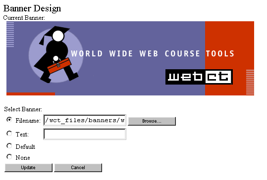
The default ``WebCT'' image is a GIF file distributed with the WebCT installation. The complete path to the file is shown in the text-entry box beside the Filename radio button. Instead of using an image file, you can specify a text message. This text message is formatted in a large font and contains the Dr. CT icon. Let's change the banner to read ``Introduction to Vectors'': select the radio button beside Text and type Introduction to Vectors, then click on Update. The resulting homepage banner is shown in Figure 2-6.

When the WebCT site administrator creates your course, they have the option of generating a default title for your course. If you select Default for the banner type, this default title is used on the homepage, formatted in the same way as the Text option. If you decide not to place a banner on your homepage, choose the None option.
If you already have a banner image made up, and have uploaded it to WebCT (see Chapter 3, File Manager), you can replace the ``WebCT'' image with your own by typing in the name of the image file into the text-entry box beside the Filename radio button. If you can't remember the exact filename, you can click on the Browse... button. This will jump to the WebCT File Browser, which we'll tackle a little later on. For now, we'll stick with the Text banner.
WebCT now displays the interactive Content Generator, which allows you to create and format text as HTML without requiring you to know HTML commands. As with homepage design, the screen is divided into two sections. The top frame shows the header elements along with a radio-button beside each element (see Figure 2-7),
while the bottom frame shows the available options (see Figure 2-8). As the header only has one element, only 1 radio button is shown. Let's modify the header: select the radio button in the top frame, and then click on Edit in the bottom frame.

The top frame now displays the various ways that you can modify the particular element of the header. We'll ignore some of the sections for now; let's concentrate on the Text Heading and Text sections (see Figure 2-9).
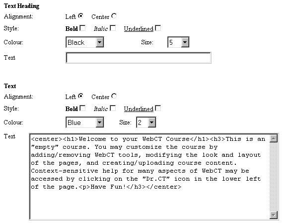
Currently, the whole header message is placed into the Text section of the Content Generator. Note that you can use HTML tags within this section if you need more control over the layout of the header.
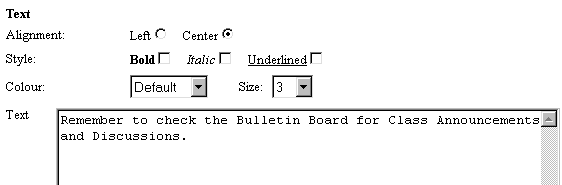
First of all, let's remove the whole text of the header: select the text by clicking your mouse at the beginning of the text area box and dragging the mouse downward to highlight the whole text. Once all of the text is highlighted, press the Delete button on your keyboard to clear the text. Now, we'll give our header a heading. In the Text Heading portion, type
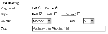
Let's also make the heading stand out by choosing Maroon from the Colour drop-down list, selecting the checkbox beside Bold in the Style section, and also selecting the radio button beside Center in the Alignment section (see Figure 2-10).
Now, let's also enter some additional comments in the Text area of the element. Type the following into the textarea box:
Remember to check the Bulletin Board for Class Announcements and Discussions.
We'll also center this bit of text, and we'll choose Default as the colour (which uses the colours specified for the homepage colour scheme). Let's also increase the size of the text from 2 to 3 (see Figure 2-11).
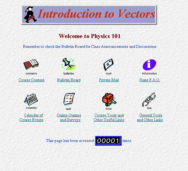
Once you've made the changes, scroll down to the bottom of the upper frame, and click on the Update button to save your changes. The top frame will now display the new header. If you are happy with how the header looks, click on Back in the bottom frame to return to the Homepage menu.
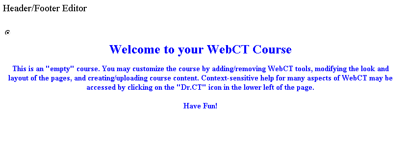
Now we'll delete the Footer of the homepage to simplify its appearance. Click on Footer in the bottom frame to again access the Content Generator. Select the radio button beside the footer's text in the top frame, and then click on the Delete button in the bottom frame. A dialog box will appear, asking you to confirm the deletion. After doing so, the text will disappear, and the footer will be blank. You can now click on Back in the bottom frame to return to the homepage. The homepage should now appear as shown below:
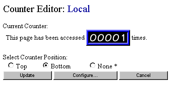
The current setting, Bottom, is selected by default. If you select Top, the counter will be placed below the banner but above the header. Selecting None will remove the counter from the homepage.
The asterisk (*) beside the None label means that None is the global default for the counter, and we're currently overriding this default by having Bottom selected. Above the radio buttons is a sample of the current counter, which can be changed by clicking on the Configure... link. Click on Configure... now to see how you can change the look of the counter. The top frame changes and displays the Counter Editor menu (see Figure 2-14).
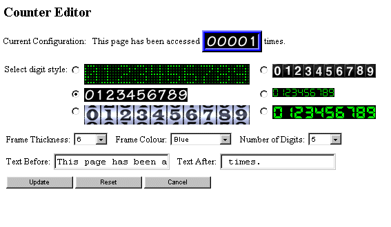
The counter display at the top of the frame shows the current counter configuration. Options that you can change are:
| Tip: You can place HTML tags into the Text Before and Text After boxes to make the text appear above or below the counter. |
Let's choose the large odometer-style digit, with the following values:

.
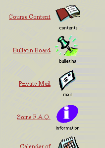
Reorganizing the HomepageYou currently have 8 links on the default homepage. Some of these links are built-in WebCT tools, while others lead to course content pages. We'll show you how to add your own content later. First, however, let's look at how we can move these links around on the homepage.
Any modification to existing links on the homepage is done by clicking on the Organize Icons button on the Homepage menu. The designer frame will now display a new menu of options:

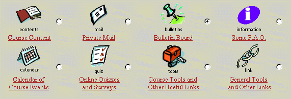
The main frame updates to show radio buttons beside each link on the homepage (see Figure 2-18).
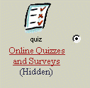
To perform an operation on an item on the homepage, you must first select the radio button beside the item, then press one of the buttons in the Organize Icons menu. You can do one of the following:
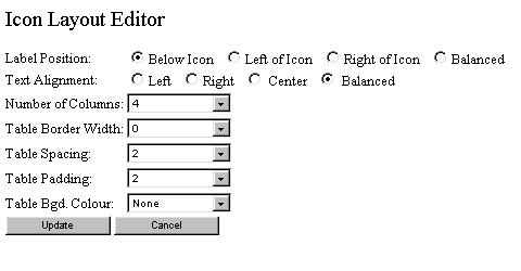
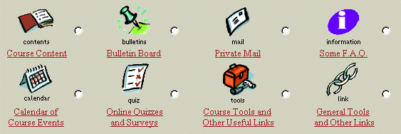
Currently, the format is set to four columns with labels appearing below the icons. Just for fun, select a one-column layout with labels beside the icon and press Update to return to the homepage. The homepage icon layout now looks like Figure 2-16.
Since a one-column layout takes up a lot of vertical space, it is probably best to stick to a multi-column layout for most homepages. Click on Layout again and select ``4 columns'' with labels below the icons as before. Click Update to save your change.
Before advancing to the next section, click on the Back button in the designer toolbar to return to the course homepage.